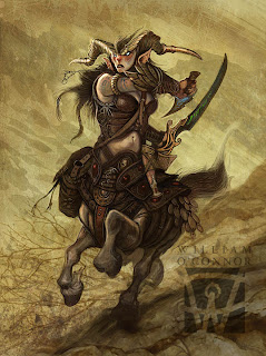
 I've been wanting to show more of my work process than I have in some of the more recent posts. The finished drawings are fun, but I've like to demonstrate the steps that I go through before I get to that finished stage, as well as many of the steps that follow the finished sketch.
For this demo I'm using my Centaur painting "Valkyrie of Pelion" as an example.
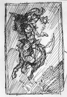
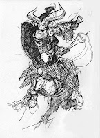
Sketchbook Thumbnails.
At night, after I've retired from the studio, my work usually continues. Almost every night I sit with my sketchbook, either watching TV or falling asleep and doodle in my sketchbook. Sometimes these doodles are for a client, sometimes for myself. These quick design sketches are almost always done in pen. I like pen because it is very graphic and doesn't allow for me to make corrections. If I were allowed to erase or fudge a sketch, I might not be willing to abandon it and move on to a better idea, also, I love the graphic starkness of pen. When I'm fleshing out a design, I don't want subtlety , I want bold graphic design elements, they either work or they don't. 90% of these imaes are never seen, and never amount to anything. Maybe I'll do a post on my vast slush pile of misfit thumbnails....
In the two doodles above the 1st is a simple design comp with no detail, the second is a costume design sketch to work out the mechanics and aesthetics of the wardrobe. These are like shorthand notes to myself before write a first draft.
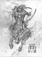 Finished Sketch:
 Once I've settled on a strong design I move to my sketch phase. This is either done in pencil (as in this example) or in digital. At this point I try to work out as many of the details as possible. This makes the painting process easier since these decisions will not have to be made later, and its very important that the client see exactly what they are going to get.
It's at this point that sketch revisions happen with the client. The art director may have aesthetic or design alterations and the other departments will usually have detail corrections (such as: "She should have a long sword, not a sabre",) One or two rounds of corrections should be plenty to make every one happy.
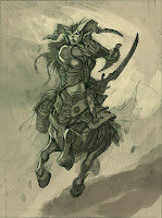 Under Painting:
At this stage I begin to flesh out my lighting and under painting. I limit my palette to a very muted color. This allows me to focus on form and light. This image is done in photoshop, but the technique is identical when I'm working in paint. When working with a client I usually do not present a color comp unless its requested or if I'm presented with a stark difference of options. (like sunshine vs. moonlight) but again, the lighting and color is often dictated by the setting or details in the art order. (If the description says the character is in a swamp carrying a flame sword, your palette is pretty much decided for you.)
For this piece I've chosen a muddy earth tone palette that will allow me to "pop" bright colors later on.
The Finished Painting (Top Picture)
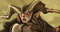
I render the finished illustration using lots of consecutive layers of texture files. Some of these are home-made and some are from texture libraries. I love to experiment with what layer modes and effects can do. Like glazes. Some are Multiplied, others are Color Dodged and others are lightened. This goes back to my early years as a multi-media and photography student.
The rendered detail and color just takes time and patience with lots of brush strokes. Working digitally gives you the opportunity to create an infinite number of brushes. Experiment to find which work for you, and don't just use the default brushes, (Or someone else's). Popping highlights, and laying in dark shadows brings the finish into focus.
Have Fun!
WOC
©2010 William O'Connor Studios
www.wocstudios.com

Another great look into your process. Thank you for sharing. I also find putting more detail into my drawings and sketches makes the final painting go much smoother, since as you said all the major elements would already have been solved for once you start painting. Can't wait for the next installment.
ReplyDeleteThanks for sharing, it's always wonderful to see artist's professional process. Beautiful piece, also!
ReplyDelete