Wednesday, December 30, 2015

Star Wars: The Force Awakens Review


by William O'Connor


!!Spoilers!!

I hardly ever review movies because although I have a lot of opinions and consider myself an ardent cinephile, I am not a film critic.  Star Wars: The Force Awakens is an exception for several reasons. One.  The mythology is so ingrained in my imagination that I feel extremely invested in the story.  Two.  I work in the Sci-Fi industry and have worked extensively on Star Wars projects for Lucas Films and its license holders in the past.   There are three ways to review this movie.  First as a movie, secondly as a Star Wars movie, and thirdly as act one in a three act play.

First as a movie.  There are always three criteria I use to measure a film. Writing, Acting and Cinematography.  Objectively, the writing of the screenplay (by JJ. Abrams and Kasdan) was darker and grittier for Force Awakens.  Immediately Mr. Abrams establishes the tone that this movie is a human drama, with the death of a stormtrooper that bleeds and dies.  This is not a video game of nameless, lifeless CGI droids being cut down, but real people with real emotions. The dialogue and action was very dense and the scenes and characters raced along at a frenetic pace, which may require me to watch it a second time just to catch things I missed. This aesthetic is quite common among contemporary super hero movies and particularly Mr. Abrams' films, which I find a little disorienting, but forces your attention.  There were a few scenes, such as the monster hallway chase scene aboard Han Solo's Freighter, that had hallmarks of Cabin in the Woods and Aliens, that just seemed silly and unnecessary. Abrams has the Post-Modern habit of inserting pop and historical cultural references into his films much like Quinten Tarrentino, both as homage and as a self deprecating awareness.  "I know, that you know that I know that I'm borrowing this idea." he seems to be saying.  Supreme Leader Snoke (Andy Sirkis) was obviously inspired by The Wizard of Oz,  the Temple of Maz Katana looked like the bath house from Miyazaki's Spirited Away,  the Starkiller base carved out of a planet's interior had the reminder of many a Bond Villain lair, the shot of the tie fighters coming out of the sun was a direct homage to Apocalypse Now,  Han Solo being run through by his own son was a tribute to King Arthur and Rey being stranded on a craggy island with her father* is a lift from Shakespeare's The Tempest. (even my 9 year old daughter caught that one). There's more, but I'd have to watch it again to catch them all.  It was obvious that Abrams' key as writer and director was to make Force Awakens seem as familiar as possible.

Although the plot arc heavily mirrored the original 1977 New Hope, the script pays homage to Episode IV while giving the story a fresh face, staying within the strict Campbellian Monomyth guidelines of Hero's Calling,  Spirit Guide, Finding the Magic Sword and Departure on the Quest.  The added sense of humor that was thrown in was a much welcome change from the earnest drudgery of the prequels.

Secondly, the acting.  The standout performance was by Daisy Ridley as Rey.  Beautiful without being too pretty, youthful without being girlish, strong without loosing her femininity, intense and funny, she, without a doubt, was the keystone to this film and held it up admirably on her young shoulders. The other performances were fine.  John Boyega as Finn was funny as the born again storm trooper turned resistance fighter (inspired by Robot Chicken's Gary the Stormtrooper?), as well as Oscar Isaac as Po Dameron the brash and cocky fighter pilot.  Adam Driver playing the emotionally tortured Kylo Ren was excellent, adding a deep sense of gravitas to the role.  Performances by Harrison Ford and Carrie Fischer were fairly lifeless and forgettable.  Fisher in particular, whose extreme plastic surgery seemed to make it impossible to perform facial expressions or move her lips was more robotic than the droids.

Thirdly, the Cinematography.  By this I mean all the art production including editing, costumes, makeup, special effects and music as well as camera work.  This film looked a great deal different than previous Star Wars films.  The first difference I noticed was, no screen wipes, which for me is a hallmark of the Star Wars aesthetic, but thankfully no lens flares either.  The set designs were more natural than earlier productions as well.  Where in all the other films the characters go to exotic locations  in Force Awakens the environments were fairly recognizable.  A desert in Tunisia with sweeping pans of Lawrence of Arabia, A forest in Montana, A glacier in Iceland, and even a World Heritage ruins in Ireland.  All the locations were recognizable as places on Earth, not a Galaxy Far, Far Away, unlike Pandora of Avatar for example.  This again harkens back to Abrams' apparent desire to ground the movie in the familiar.  This added a much needed shot of realism compared to the CGI video game environments of the prequels, but didn't make the galaxy seem particularly diverse or alien.  Costumes and makeup were excellent, as well as the design of ships and hardware.  Everything was in keeping with the Star Wars classic aesthetic so that the viewer could easily follow good guys and bad guys, again the formula of the familiar.  The only artistic misstep was in the places where CGI was used too heavily.  Supreme Leader Snoke looked like a cross between Gollum and Voldemort, Maz Katana looked like a smurf  and the CGI roly-poly D&D Beholders on the space freighter were glaring CGI inserts that didn't seem necessary and broke the realism of the rest of the film.  The spiraling camera angles of the dogfights were hugely enjoyable having everyone in the audience sway and squeal as if on a roller coaster. Finally, the impressive score by Williams was much enjoyed and added to the familiar and beloved flavor of Star Wars.

Overall Score: B
Overall ranking as a Star Wars Movie: 4th, (1:Empire; 2:New Hope 3:Jedi)


Predictions for Acts Two and Three

As with all Campbellian myths, this story needs to have a predictable arc in the future.  Student trains with the master, learns new skills and wisdom, descends into the dark other-world, does battle with the dragon using the magic sword, sacrifice of flesh, death and resurrection and or redemption followed by the return of the hero.   How those details play themselves out will be the interesting part.  That doesn't bother me.  That's how hero stories progress.  Just as my knowing that Macbeth and Hamlet will die in the end doesn't stop my enjoyment of watching the tragedies over and over.  This is just Act one of a Three Act play.


Enjoy!

WOC


Wednesday, December 9, 2015

Joan of Arc: Part 2 Final Drawing

by 
William O'Connor

"Joan of Arc" Graphite and Gesso on Wood Panel 24"x48"

My Joan of Arc painting is progressing quickly, but when the Muses strike you have to work!

I began by griding off my gessoed panel in order to enlarge the sketch to the board, but immediately realized that this was not a technique that was going to work.  Using the grid technique is ideal when blowing up photographs to eliminate distortion in the proportions, but for this drawing the proportions had already been composed, and the grid would take too long.


Instead, I used a technique that I have been employing for years.  I blew up the sketch in the computer to the size I needed and printed out the image on a series of 11"x17" sheets.  Tiling them together I used a 6B graphite block to blacken the backside.  Positioning the carbon copy over the panel I used a red ballpoint pen to trace the sketch onto the surface of the panel.  I use red so that I can keep track of the transfer work.


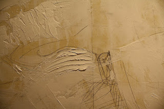
Once the sketch has been roughly transferred I begin drawing the details onto the panel.  At this point I adopted a medium that I had never used before.  Super Heavy Gesso.  This material has the consistency of thick oil paint, but dries in a matter of minutes with a smooth chalk-like surface that is ideal for drawing on.  Instead of erasing my corrections I spackled the heavy gesso like joint compound with a palette knife adding dimension to the surface while rendering detail with the pencils.  Spot sanding the gesso smooth is also very quick and simple.  I had never used this technique before, but the physicality of sculpting the painting was very enjoyable, allowing me to make large changes quickly.


To the detriment of my bad back I spent many hours rendering details and repositioning elements.  Researching Latin phrases for the banner and finding medieval ornaments that complimented the costuming.  The biggest changes I made was that I positioned the figure of Joan more towards the center, in order to replicate the symmetry of Gothic equestrian paintings, entering the banner logo so to create a halo element behind Joan's head, and repositioning the dove to add movement into the composition.

At this point I have done all the work necessary to begin painting.  After a three day drawing marathon my back is giving out and I need to take a break! Much of this detailing will be obscured by subsequent layers of paint, but will act as a guide as I move forward.


Keep watching to see how it progresses.

Enjoy


WOC

Below I have added some of the reference that I am using as inspiration for this painting.


Monday, December 7, 2015

Joan of Arc: Part 1

By William O'Connor


Once again I have begun a large scale personal painting project, and once again I thought that I would share my process with the public.  The advantage of a personal piece is that I am free to share the process in "real time" without the constraints of an NDA.

Recently I wrote a blog about Joan of Arc at Muddy Colors.  The research that I did included a great deal of work to understand this historical, religious figure and her context to art and history.  This extensive study made me want to try to do an image of St. Joan myself.

"Joan ofArc" 10"x20" graphite on paper

"Joan of Arc" 10"x20" graphite and digital

I did a variety of sketch comps until I came up with one that I was happy with.  This sketch included the elements that I was trying to explore.  A Gothic sense of grandeur including all the heraldry and pomp of the 100 years war, as well as the austerity of an altarpiece from the 15th century (ala: Van Eyck).

I developed a color comp using the computer over the sketch and decided that this was a piece that could be a successful painting.  I wanted the piece to have the size to accommodate all the intricate details I envisioned, and the gravitas to do homage to the subject.

I settled on a 24"x 48" format using birch panel.  This was both a creative and practical decision.  24"x48" is a little more than double the size of the sketch, and conveniently is the size of panel that comes pre-cut from the local home supply store.  My experience with wood panel in the past has been that any cutting with a circular or table saw produces a shivered edge, so this eliminated that problem.  I have never used wood panel before (preferring hardboard) but I thought I would use this support for its light, rigid and economical benefits.  The hard surface should prevent any chips and corner damage, and many of my colleagues have recommended it.  I gave the panel three coats of gesso, sanded smooth, the last lightly tinted with Yellow Ochre to eliminate the glaring white.

This painting will be approached very differently than my last online painting "The Gandalf Triptych".  With this image I have already settled on a composition, color design and general detailing, which in the last painting was not decided until the final phase of the work.

Joan of Arc drawing with gessoed panel


With an overlay of acetate gridded-off with two inch squares over the drawing I'm preparing to transfer the drawing to the sized panel.  This sketching stage will be very labor-intensive because of the amount of detail that I've designed, but I hope will save me work in the long run.  At over 1000 square inches this will be the largest painting I've embarked on in over 15 years.  I have no deadline, so I have no estimate of when it will be completed.  Now comes the hard part. Wish me luck!

PS.  I'm still toying with the title: "Joan of Arc"; "St. Joan of Arc"; "Joan d'Arc"; "Jeanne d'Arc"; and "The Maid of Heaven".  Please leave any questions or suggestions in the comments section.

Keep watching and follow to see the next stage when its complete.

Thanks


WOC


Sunday, November 29, 2015

20,000 Leagues Under the Sea

by 
William O'Connor


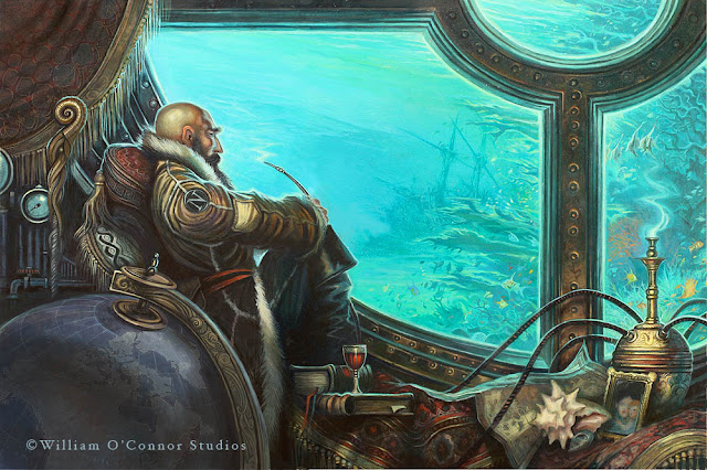
I am very excited to be able to share some of the work that I have done for my latest illustrated book 20,000 Leagues Under the Sea by Jules Verne.

This project has been under development for nearly 20 years!  I first read the book in 1995 and immediately became fascinated with the exciting imagery that Verne described in the text.  My first interest in the story was to see how accurate Verne had been in his wonderful descriptions.  I was surprised by how different the text was to all the previous depictions that I had seen during my childhood.  The story of Captain Nemo was much darker and more mature than the children's versions that I had experienced.  Also, Verne's detailed schematics of the ship, equipment and locations were so specific I wondered if they could be rendered based solely on his writings.

Beginning with the design of the Nautilus itself, I mapped the schematics that Verne related in the text down to the last detail and discovered that they made for an extremely believable ship.  The design that I rendered was word for word with he text, making a lovely vessel that was true to the story.

In the late nineties I had enough artwork to shop the idea to several publishers.  My result was editors responding saying that they liked the artwork, but that they already had an illustrated version of this classic.  My endeavor however was to create a full unabridged and illustrated edition which had never been done before.  Despite the rejections from publishers I continued to work on the idea for the next several years on and off.

Around 2010 I struck upon the idea of a Steam Punk version, seeing that genre becoming popular with the public.  Re-reading the text again for at least the fifth time I produced detailed schematics and some new artwork with this theme in mind.  In 2011 Sterling publishing contacted me to let me know they were interested.  They too were interested in the fact that an illustrated unabridged text had never been available and we soon contracted the book to be completed.

The research and creation of the hundreds of pieces of artwork to be included in the book was daunting but enjoyable.  I wanted the book to have the same feel of the great Golden Age of Illustrations classics by Pyle and Wyeth.  It has been a long road to see this book come into production, but one that I hope the readers will appreciate as much as I did creating it.

Enjoy.

WOC

to purchase this book visit:

Amazon    


Barnes and Noble 


Monday, November 23, 2015

The Gandalf Triptych-Part 6: Finish

by
William O'Connor


Finally Finished!!

Those of you that have been following the journey that I have been making with this painting for the past 6 months have been wonderfully supportive.  The Gandalf Triptych was completed and debuted at the Illuxcon Exhibition in October, and the reception they received was wonderful!  The set was sold to a private collector, and I shipped them off a couple of weeks ago to their new owner.

Its been many months since my last blog about this painting, because as I said, it would probably take as much time to complete the details as all the steps up to that point combined, which turned out to be true.  Details, Gold Border and Frames were all decided within the last month of the work.

I'm very pleased with the result.  This was a challenge that I gave myself to try to challenge what I could do as an artist.  Three paintings that would would work individually and as a set.  There were points in the process where I considered quitting, but I slogged through it and finished what I started. Posting the process with no knowledge of the outcome was an added challenge.  I learned a lot along the way, I hope some of you did too about the work that artists put into their creations.  The painting is the work, and the final product is only the veneer of the process.

Enjoy.

WOC

Gandalf Triptych Part1 Mines of Moria
©2015 William O'Connor

Gandalf Triptych Part2 Minis Tirith
©2015 William O'Connor

Gandalf Triptych Part3 The Grey Havens
©2015 William O'Connor


 all images and text are © Copyright William O'Connor and William O'Connor Studios

Monday, July 20, 2015

The Gandalf Triptych- Part 5

William O'Connor

Gandalf Triptych work in progress with rough layout of framing and display mock-up

It has been a bit over two months since my last update about the Gandalf Triptych that I've been working on in my free time.  Free time is something is hard to come by.  Currently proofing a new book due out in the fall and another due out in August has kept me busy and not painting, but as promised I have made progress.

I've moved into the Focussing Phase of the paintings.  This is where the design, lighting and underpainting is completed, and now its time to begin refining details and making smaller decisions.  This is one of the hardest parts of painting because what starts out as what appears to be a sloppy mess, begins to come into focus as a storytelling picture, and where I'm most likely to give up and put into my slush pile of unfinished work.

This is very much the adolescent phase of a painting, that every parent of a teenager knows all to well.  Conception was the easy part, the growing pains and sleepless nights of early childhood are over, but now its all clumsy, awkward,  emotionally distraught pangs of pimply shyness that argues with you at every turn.  You think it will never get its act together and turn out okay.  But, as every artist and parent will tell you, it all will be okay.  Every painting goes through that phase to become the mature, young adult you hoped it would be and you begin to see the adult painting it will become.

Here are a few pics of the triptych as they are now.  Click to enlarge and see details.

The next and final painting phase will be the Detail Phase where glazes and details are rendered to finish the pieces.  This will be the most time consuming, but least stressful, since all the creative decisions have all been made.

Enjoy


WOC

Grey Havens Pt.1
Grey Havens pt.2
The Gates of Minith Tirith

Cave of the Goblin King


Monday, May 4, 2015

Scroll Landscape: Part 4 (The Gandalf Triptych)

William O'Connor

The scroll trilogy paintings are starting to come into focus.  I think I can officially rename the piece from the ambiguous "Scroll Landscapes", to "The Gandalf Triptych."

In order to echo more of a Japanese aesthetic, I consider the concept of including a frame painted into the design.  I have never done this before, and I'm not sure on how it will be fulfilled, (whether a painted frame or applied graphic or even gold gilding.)  But I've masked off the appropriate surround with tape to include this into the design. If this concept does not work out I can always paint over it later.

Pressing onward I begin the "Pushing Paint" phase of my painting.  This is just what it sounds like and is just as fun.  Since all three pieces are to be interrelated, I'm painting them together, and once again being influenced by my Japanese source material, I'm picturing a very monochromatic gray tonal image for all three. 

Gray-Blue-Green.  This is a great undertone for covering the canvas.  It lends itself to tonal mood, and atmosphere, while can also be easily punctuated with colors leading into the purple-violet-red scale allowing popping orange-yellow highlights of fire and light to accent the design.  This will also stand out very nicely with the envisioned gold-gilt framing.

Here I'm pushing the design's value scale from mid tone washes into a misty cool background with deep rich foreground elements.  This "Pushing Paint" stage is still very abstract and loose.  My intent is to get the entire canvas covered with paint.  This is not one of those paint-by-number paintings, where you first paint the face, then paint the tree, then paint the cloak, then paint the hair, etc. and follow the steps until its done.  I'm designing as I go, carving and softening edges and shapes and forms out of paint until the positive and negative elements work individually and as a triptych.  This is both thumbnail and painting at the same time.  The lump of clay beginning to take shape.  I'm trying to create a mirror image in the left and right panels, with the Mines of Moria and the Ruins of the Gray Havens having similar shapes. The central panel is symmetrical.

Still early days.  Keep posted to see what happens next!

Enjoy 

WOC


Monday, April 27, 2015

Scroll Landscape: Part 3

William O'Connor

I have spent some time imagining the triptych landscape series. I've begun to approach the images from a purely thematic basis.  I have decided that the trilogy will have the theme of focusing on the character of  Gandalf.

Designing the three panels together allows me to compose three individual images that will work as a set or individually.  Working very loosely with oil paint washes allows a free-form sketching process open to a great deal of alteration and manipulation as I proceed.  This is the part of painting I enjoy the most.  It looks like a mess, but this is where I'm making the important decisions!

I decide that the two panels to the left and the right should be compositionally similar, echoing one another.  The left hand panel being Gandalf leading the Fellowship of the Ring into the Mines of Moria.  The right side panel should be Gandalf and the Heroes of the Ring departing Middle Earth from the Gray Havens.  In the Middle, the fulcrum of the story arc, being Gandalf standing at the Gates of Minis Tirith fending off The Lich King.

Compositionally the two bookends should echo one another in design, with angular forms, while the center panel will represent Gandalf the White in his full splendor and moment of greatest power!

This is still being sketched and conceived as I proceed, so may very well change dramatically.  I'm of a mind that the center panel should be larger in the tradition of catholic alter pieces, but that would mean starting that panel over again.  Something that an artist must consider, not to be limited by your medium...

Stay tuned.


Enjoy


WOC