Showing posts with label Illustration. Show all posts

Wednesday, December 7, 2016

Fantasy Character Workshop #004

William O'Connor

Working as a fantasy illustrator for over twenty years I have created hundreds (maybe thousands) of fantasy characters.  When I was a student I would draw the characters of all the players in my gaming group.  later working for various games I would be commissioned to illustrate and design characters from stories.  As an artist many of these commissions became derivative to the point of becoming boring (Dwarf Fighter with an Axe, Elf Ranger with a Bow, etc.)  so I strove to change things up and make sure that I was always coming up with new combinations.  I created my Random Character Generator. (attached below).  This was based upon the appendixes that were listed in the back of the D&D Dungeon Master's Guide when I was a kid.  I started using this generator routinely, and still employ it when creating characters and when teaching character design to students.

This series is intended to use my generator to create characters on a regular basis to share the process with you.  I will try to be as faithful as possible to the attributes that are created, as the series is meant to challenge my skills, and make the characters as difficult as possible.

Enjoy
WOC

______________________________________________________________


Fantasy Character Workshop #004 
"Gladiator of the Frost Dragon"

Race: Half-Elf
Gender: Male
Class: Gladiator
Armor: Chainmail
Weapon: Rapier(Frost)/Mace
Missile:  Blowgun
Motiff: Dragon
Equipment: Rope, Coffer, Award, Flute

This was a direct study of the generated character.  Sometimes you need to keep it simple and tell the story using the details you're given.  In this case, with a dragon motif and a frostbrand rapier I thought of a large frost dragon skull helmet, but then I realized, that would hide his racial identity.  So I went in the opposite direction and shaved him bald and painted a white dragon on his face.  much scarier.  Fighting two handed would make him quick so the chainmail became a gladiatorial tunic that would allow for free movement.  The award for his victories is attached to his shoulder.

Note: This sketch was a test for my brand new Wacom tablet.  Taking some time to get all the new buttons and preferences just the way I like them.  Usually, I turn off about half of the functions.

Enjoy

WOC


Sunday, February 28, 2016

Joan of Arc: Part 3 Color

William O'Connor


As promised I am still working on my very large St. Joan painting when I find the time.  Above is the most recent phase up to this date in the process.

This phase is my underpainting stage.  Below you can see the process of laying on the paint.  I begin with a tonal painting of acrylic.  I chose acrylic because of the sheer square footage of surface and the drying time and fumes that would be created by this stage in oil.  Once I am satisfied with the forms I're created of positive and negative shapes I can begin separating some of the objects into colors. At this point I switch into oil.  The difficulty is to know when to switch, because once you start with oil you can't go back to acrylic.  This process is fairly quick, scrubbing in shapes and forms of color.  I'm not concerned about detail.  This is still the same technique that I was taught as a student.  My teacher used the analogy of a sculptor and a block of stone.  Work the whole painting at the same time, bring it into focus slowly. That old adage of the sculpture being locked inside the marble and its up to the sculptor to remove the unnecessary parts.  This is more additive than marble carving, but the theory is the same.  I can picture what it will look like, I just have to put all the brush strokes in the right places in the right order.

Enjoy

WOC


Wednesday, December 9, 2015

Joan of Arc: Part 2 Final Drawing

by 
William O'Connor

"Joan of Arc" Graphite and Gesso on Wood Panel 24"x48"

My Joan of Arc painting is progressing quickly, but when the Muses strike you have to work!

I began by griding off my gessoed panel in order to enlarge the sketch to the board, but immediately realized that this was not a technique that was going to work.  Using the grid technique is ideal when blowing up photographs to eliminate distortion in the proportions, but for this drawing the proportions had already been composed, and the grid would take too long.


Instead, I used a technique that I have been employing for years.  I blew up the sketch in the computer to the size I needed and printed out the image on a series of 11"x17" sheets.  Tiling them together I used a 6B graphite block to blacken the backside.  Positioning the carbon copy over the panel I used a red ballpoint pen to trace the sketch onto the surface of the panel.  I use red so that I can keep track of the transfer work.


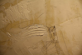
Once the sketch has been roughly transferred I begin drawing the details onto the panel.  At this point I adopted a medium that I had never used before.  Super Heavy Gesso.  This material has the consistency of thick oil paint, but dries in a matter of minutes with a smooth chalk-like surface that is ideal for drawing on.  Instead of erasing my corrections I spackled the heavy gesso like joint compound with a palette knife adding dimension to the surface while rendering detail with the pencils.  Spot sanding the gesso smooth is also very quick and simple.  I had never used this technique before, but the physicality of sculpting the painting was very enjoyable, allowing me to make large changes quickly.


To the detriment of my bad back I spent many hours rendering details and repositioning elements.  Researching Latin phrases for the banner and finding medieval ornaments that complimented the costuming.  The biggest changes I made was that I positioned the figure of Joan more towards the center, in order to replicate the symmetry of Gothic equestrian paintings, entering the banner logo so to create a halo element behind Joan's head, and repositioning the dove to add movement into the composition.

At this point I have done all the work necessary to begin painting.  After a three day drawing marathon my back is giving out and I need to take a break! Much of this detailing will be obscured by subsequent layers of paint, but will act as a guide as I move forward.


Keep watching to see how it progresses.

Enjoy


WOC

Below I have added some of the reference that I am using as inspiration for this painting.


Monday, December 7, 2015

Joan of Arc: Part 1

By William O'Connor


Once again I have begun a large scale personal painting project, and once again I thought that I would share my process with the public.  The advantage of a personal piece is that I am free to share the process in "real time" without the constraints of an NDA.

Recently I wrote a blog about Joan of Arc at Muddy Colors.  The research that I did included a great deal of work to understand this historical, religious figure and her context to art and history.  This extensive study made me want to try to do an image of St. Joan myself.

"Joan ofArc" 10"x20" graphite on paper

"Joan of Arc" 10"x20" graphite and digital

I did a variety of sketch comps until I came up with one that I was happy with.  This sketch included the elements that I was trying to explore.  A Gothic sense of grandeur including all the heraldry and pomp of the 100 years war, as well as the austerity of an altarpiece from the 15th century (ala: Van Eyck).

I developed a color comp using the computer over the sketch and decided that this was a piece that could be a successful painting.  I wanted the piece to have the size to accommodate all the intricate details I envisioned, and the gravitas to do homage to the subject.

I settled on a 24"x 48" format using birch panel.  This was both a creative and practical decision.  24"x48" is a little more than double the size of the sketch, and conveniently is the size of panel that comes pre-cut from the local home supply store.  My experience with wood panel in the past has been that any cutting with a circular or table saw produces a shivered edge, so this eliminated that problem.  I have never used wood panel before (preferring hardboard) but I thought I would use this support for its light, rigid and economical benefits.  The hard surface should prevent any chips and corner damage, and many of my colleagues have recommended it.  I gave the panel three coats of gesso, sanded smooth, the last lightly tinted with Yellow Ochre to eliminate the glaring white.

This painting will be approached very differently than my last online painting "The Gandalf Triptych".  With this image I have already settled on a composition, color design and general detailing, which in the last painting was not decided until the final phase of the work.

Joan of Arc drawing with gessoed panel


With an overlay of acetate gridded-off with two inch squares over the drawing I'm preparing to transfer the drawing to the sized panel.  This sketching stage will be very labor-intensive because of the amount of detail that I've designed, but I hope will save me work in the long run.  At over 1000 square inches this will be the largest painting I've embarked on in over 15 years.  I have no deadline, so I have no estimate of when it will be completed.  Now comes the hard part. Wish me luck!

PS.  I'm still toying with the title: "Joan of Arc"; "St. Joan of Arc"; "Joan d'Arc"; "Jeanne d'Arc"; and "The Maid of Heaven".  Please leave any questions or suggestions in the comments section.

Keep watching and follow to see the next stage when its complete.

Thanks


WOC


Sunday, November 29, 2015

20,000 Leagues Under the Sea

by 
William O'Connor


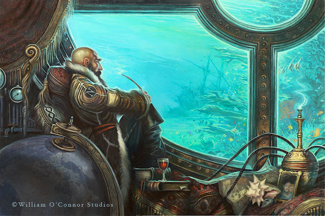
I am very excited to be able to share some of the work that I have done for my latest illustrated book 20,000 Leagues Under the Sea by Jules Verne.

This project has been under development for nearly 20 years!  I first read the book in 1995 and immediately became fascinated with the exciting imagery that Verne described in the text.  My first interest in the story was to see how accurate Verne had been in his wonderful descriptions.  I was surprised by how different the text was to all the previous depictions that I had seen during my childhood.  The story of Captain Nemo was much darker and more mature than the children's versions that I had experienced.  Also, Verne's detailed schematics of the ship, equipment and locations were so specific I wondered if they could be rendered based solely on his writings.

Beginning with the design of the Nautilus itself, I mapped the schematics that Verne related in the text down to the last detail and discovered that they made for an extremely believable ship.  The design that I rendered was word for word with he text, making a lovely vessel that was true to the story.

In the late nineties I had enough artwork to shop the idea to several publishers.  My result was editors responding saying that they liked the artwork, but that they already had an illustrated version of this classic.  My endeavor however was to create a full unabridged and illustrated edition which had never been done before.  Despite the rejections from publishers I continued to work on the idea for the next several years on and off.

Around 2010 I struck upon the idea of a Steam Punk version, seeing that genre becoming popular with the public.  Re-reading the text again for at least the fifth time I produced detailed schematics and some new artwork with this theme in mind.  In 2011 Sterling publishing contacted me to let me know they were interested.  They too were interested in the fact that an illustrated unabridged text had never been available and we soon contracted the book to be completed.

The research and creation of the hundreds of pieces of artwork to be included in the book was daunting but enjoyable.  I wanted the book to have the same feel of the great Golden Age of Illustrations classics by Pyle and Wyeth.  It has been a long road to see this book come into production, but one that I hope the readers will appreciate as much as I did creating it.

Enjoy.

WOC

to purchase this book visit:

Amazon    


Barnes and Noble 


Thursday, July 30, 2009

Welcome


Welcome to the William O'Connor Studios Blog.

I hope to be able to use this site to better interact and discuss art with friends and fans, and to share my work in a more timely way. I'm looking forward to sharing ideas and suggestions on what you would like to see in the site.
My interests hopefully will span from sharing ideas and sketches, to subjects more tutorial and educational.

My personal website is still available at: www.wocstudios.com

Thanks.

WOC