Wednesday, December 15, 2010

Caravaggio ArtNotes


Recently discovered art notes from Caravaggio's famous
"Crucifixion of St. Peter"...


Dear Caravaggio-
Sorry this is getting to you so late, things have been hectic around here and we're all playing catch-up.
First of all everyone here loves your painting, we think its really cool, great lighting and the drama is excellent. There are however a few changes we'd like you to make.
1- The Art Description says that the crucifixion is in a colloseum, and the designers feel thats really important. It doesn't have to be much, just maybe a crowd with a touch of classical architecture and maybe a tiger or two-totally up to you. The black is just too flat.
2- R&D says that the Roman soldier's costumes do not match the style guide. If you need reference let me know and I'll send it to you.
3-Please turn the foreground soldier around so we could see his face instead of his butt?
4-The colors are a bit muddy and dark, would it be possible to brighten up the palette and add some color?
5- St. Peter needs to have some glowing rune tattoos or a halo or something to make it obvious he's a high powered priest.

Thanks a lot, Could you get the changes in by friday, You Rock :o)

Dracopedia Wall Calendar from Zazzle.com

Dracopedia Wall Calendar from Zazzle.com


Now available for the Holidays.

WOC

Friday, December 3, 2010

Redcrosse Knight and the Dragon: Part1


The Redcrosse Knight and the Dragon: Part1

Few stories are more captivating than that of the Redcrosse Knight and the Dragon. The epic verse of a brave young knight who battles a titanic fire-breathing dragon for three days is one of the most dramatic conflicts in English literature. To read the text click here: (Faerie Queene. Book1, Canto 11)
I have always wanted to illustrate the scene for some years but have never found the opportunity. A recent private commisssion has allowed me to explore this story again and I am using the chance to post its evolution on this blog.

This first part shows the sketching stage of the project as I explore different possible compositions and angles. This is by no means finished, and as a work in progress I hope to show all the false starts and corrections that an artist makes as a project develops.

Keep checking back for updates and evolutions....


WOC

Sunday, November 28, 2010

Yes, Samantha, there are unicorns....

My daughter, Samantha (4), is going through, as most girls do, a Unicorn phase. Possessing the beauty of horses and the magic of fairies unicorns have become her new "thing". Everything we draw and almost all the stories we tell have to include a unicorn.
I suppose I could buy a "My little Pony" and a copy of "The Last Unicorn" and be done, but Samantha is the daughter of a fantasy artist, and that just wouldn't do!
Fortunately for us we live not far from the most beautiful Unicorn art in history. The famed "Unicorn Tapestries" of the Metropolitan Museum of Art are housed in The Cloisters, which in itself is a work of art. Five unicorn tapestries are the centerpiece of this medieval art and architecture complex overlooking the palisades of the Hudson River, and are one of the best art destinations in NYC.
As a young man fascinated with medieval art and culture I would beg my parents to go to the Cloisters, but now living so close we go several times a year. This Sunday my family and I decided to see the "Unicorn Castle" again. Strolling through the halls of art and the stone cloisters on a cold November day, we had the museum to ourselves. We went from room to room finding griffins and dragons, and a whole bestiary of creatures carved into capitols and frescoed on walls, glazed into stained glass, gilded in candelabras and, of course, woven into tapestries. From the point of view of a four year old (and a forty year old) it was magical. I don't think I'll be taking up weaving or unicorns anytime soon, but a trip to the Cloisters is always an inspiring day!

Enjoy!
WOC

to learn more about The Cloisters visit:
Metropolitan Museum: The Cloisters


©2010 William O'Connor Studios
www.wocstudios.com

Monday, November 8, 2010

Illustration Process "Centaur"

I've been wanting to show more of my work process than I have in some of the more recent posts. The finished drawings are fun, but I've like to demonstrate the steps that I go through before I get to that finished stage, as well as many of the steps that follow the finished sketch.
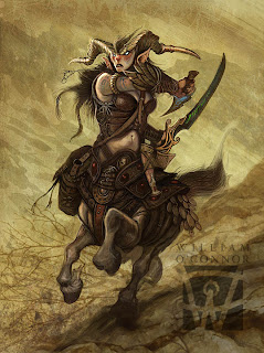
For this demo I'm using my Centaur painting "Valkyrie of Pelion" as an example.
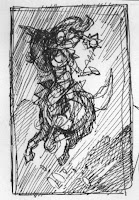
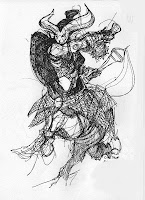


Sketchbook Thumbnails.

At night, after I've retired from the studio, my work usually continues. Almost every night I sit with my sketchbook, either watching TV or falling asleep and doodle in my sketchbook. Sometimes these doodles are for a client, sometimes for myself. These quick design sketches are almost always done in pen. I like pen because it is very graphic and doesn't allow for me to make corrections. If I were allowed to erase or fudge a sketch, I might not be willing to abandon it and move on to a better idea, also, I love the graphic starkness of pen. When I'm fleshing out a design, I don't want subtlety , I want bold graphic design elements, they either work or they don't. 90% of these imaes are never seen, and never amount to anything. Maybe I'll do a post on my vast slush pile of misfit thumbnails....
In the two doodles above the 1st is a simple design comp with no detail, the second is a costume design sketch to work out the mechanics and aesthetics of the wardrobe. These are like shorthand notes to myself before write a first draft.
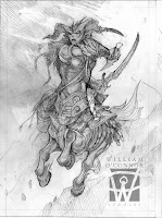

Finished Sketch:
Once I've settled on a strong design I move to my sketch phase. This is either done in pencil (as in this example) or in digital. At this point I try to work out as many of the details as possible. This makes the painting process easier since these decisions will not have to be made later, and its very important that the client see exactly what they are going to get.
It's at this point that sketch revisions happen with the client. The art director may have aesthetic or design alterations and the other departments will usually have detail corrections (such as: "She should have a long sword, not a sabre",) One or two rounds of corrections should be plenty to make every one happy.
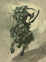
Under Painting:
At this stage I begin to flesh out my lighting and under painting. I limit my palette to a very muted color. This allows me to focus on form and light. This image is done in photoshop, but the technique is identical when I'm working in paint. When working with a client I usually do not present a color comp unless its requested or if I'm presented with a stark difference of options. (like sunshine vs. moonlight) but again, the lighting and color is often dictated by the setting or details in the art order. (If the description says the character is in a swamp carrying a flame sword, your palette is pretty much decided for you.)
For this piece I've chosen a muddy earth tone palette that will allow me to "pop" bright colors later on.

The Finished Painting (Top Picture)
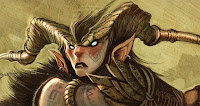


I render the finished illustration using lots of consecutive layers of texture files. Some of these are home-made and some are from texture libraries. I love to experiment with what layer modes and effects can do. Like glazes. Some are Multiplied, others are Color Dodged and others are lightened. This goes back to my early years as a multi-media and photography student.

The rendered detail and color just takes time and patience with lots of brush strokes. Working digitally gives you the opportunity to create an infinite number of brushes. Experiment to find which work for you, and don't just use the default brushes, (Or someone else's). Popping highlights, and laying in dark shadows brings the finish into focus.

Have Fun!

WOC

©2010 William O'Connor Studios
www.wocstudios.com

Thursday, November 4, 2010

WOC at Illuxcon

Thurs. 11/11/10 - 11/14/10 I will be at Illuxcon in Altoona, PA, showing off my work, signing my book and making merry with all the other artists.
Come on out to see the menagerie....

Go to the Illuxcon website to learn more

Saturday, October 30, 2010

The Astral Sea

More Dungeons and Dragons Stuff!
Here are a couple of interior paintings and the cover from:
"The Plane Above-Secrets of the Astral Sea"

There a couple of images here that were inspired by some classic paintings. My good friend Jeff Menges is doing a seminar on the influence of Golden Age illustrators on contemporary artists and it reminded me of these, so....

Enjoy-

WOC


"Pirates of the Astral Sea" (Cover)
12"x16" digital
©Wizards of the Coast


NC Wyeth


"Battle in the Astral Sea"
12"x14" digital
©Wizards of the Coast


JW Waterhouse


"Armada of the Astral Sea"
6"x8" digital
©Wizards of the Coast


©2010 William O'Connor Studios
www.wocstudios.com