Monday, July 20, 2015

The Gandalf Triptych- Part 5

William O'Connor

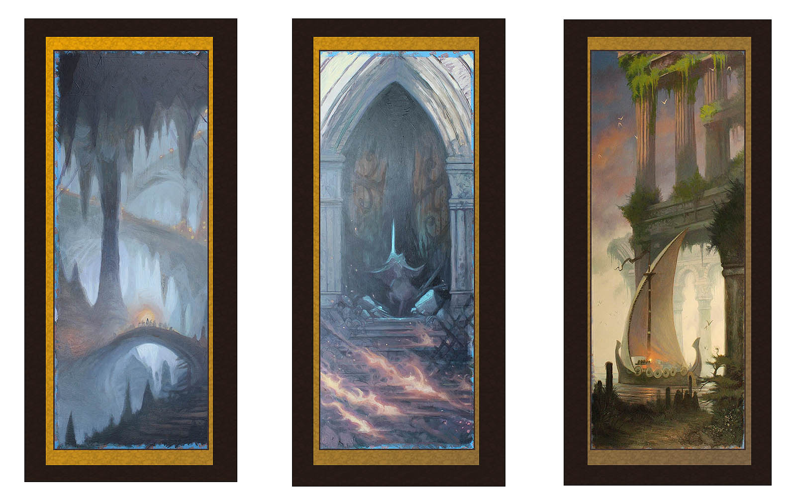
Gandalf Triptych work in progress with rough layout of framing and display mock-up

It has been a bit over two months since my last update about the Gandalf Triptych that I've been working on in my free time.  Free time is something is hard to come by.  Currently proofing a new book due out in the fall and another due out in August has kept me busy and not painting, but as promised I have made progress.

I've moved into the Focussing Phase of the paintings.  This is where the design, lighting and underpainting is completed, and now its time to begin refining details and making smaller decisions.  This is one of the hardest parts of painting because what starts out as what appears to be a sloppy mess, begins to come into focus as a storytelling picture, and where I'm most likely to give up and put into my slush pile of unfinished work.

This is very much the adolescent phase of a painting, that every parent of a teenager knows all to well.  Conception was the easy part, the growing pains and sleepless nights of early childhood are over, but now its all clumsy, awkward,  emotionally distraught pangs of pimply shyness that argues with you at every turn.  You think it will never get its act together and turn out okay.  But, as every artist and parent will tell you, it all will be okay.  Every painting goes through that phase to become the mature, young adult you hoped it would be and you begin to see the adult painting it will become.

Here are a few pics of the triptych as they are now.  Click to enlarge and see details.

The next and final painting phase will be the Detail Phase where glazes and details are rendered to finish the pieces.  This will be the most time consuming, but least stressful, since all the creative decisions have all been made.

Enjoy


WOC

Grey Havens Pt.1
Grey Havens pt.2
The Gates of Minith Tirith

Cave of the Goblin King


Monday, May 4, 2015

Scroll Landscape: Part 4 (The Gandalf Triptych)

William O'Connor

The scroll trilogy paintings are starting to come into focus.  I think I can officially rename the piece from the ambiguous "Scroll Landscapes", to "The Gandalf Triptych."

In order to echo more of a Japanese aesthetic, I consider the concept of including a frame painted into the design.  I have never done this before, and I'm not sure on how it will be fulfilled, (whether a painted frame or applied graphic or even gold gilding.)  But I've masked off the appropriate surround with tape to include this into the design. If this concept does not work out I can always paint over it later.

Pressing onward I begin the "Pushing Paint" phase of my painting.  This is just what it sounds like and is just as fun.  Since all three pieces are to be interrelated, I'm painting them together, and once again being influenced by my Japanese source material, I'm picturing a very monochromatic gray tonal image for all three. 

Gray-Blue-Green.  This is a great undertone for covering the canvas.  It lends itself to tonal mood, and atmosphere, while can also be easily punctuated with colors leading into the purple-violet-red scale allowing popping orange-yellow highlights of fire and light to accent the design.  This will also stand out very nicely with the envisioned gold-gilt framing.

Here I'm pushing the design's value scale from mid tone washes into a misty cool background with deep rich foreground elements.  This "Pushing Paint" stage is still very abstract and loose.  My intent is to get the entire canvas covered with paint.  This is not one of those paint-by-number paintings, where you first paint the face, then paint the tree, then paint the cloak, then paint the hair, etc. and follow the steps until its done.  I'm designing as I go, carving and softening edges and shapes and forms out of paint until the positive and negative elements work individually and as a triptych.  This is both thumbnail and painting at the same time.  The lump of clay beginning to take shape.  I'm trying to create a mirror image in the left and right panels, with the Mines of Moria and the Ruins of the Gray Havens having similar shapes. The central panel is symmetrical.

Still early days.  Keep posted to see what happens next!

Enjoy 

WOC


Monday, April 27, 2015

Scroll Landscape: Part 3

William O'Connor

I have spent some time imagining the triptych landscape series. I've begun to approach the images from a purely thematic basis.  I have decided that the trilogy will have the theme of focusing on the character of  Gandalf.

Designing the three panels together allows me to compose three individual images that will work as a set or individually.  Working very loosely with oil paint washes allows a free-form sketching process open to a great deal of alteration and manipulation as I proceed.  This is the part of painting I enjoy the most.  It looks like a mess, but this is where I'm making the important decisions!

I decide that the two panels to the left and the right should be compositionally similar, echoing one another.  The left hand panel being Gandalf leading the Fellowship of the Ring into the Mines of Moria.  The right side panel should be Gandalf and the Heroes of the Ring departing Middle Earth from the Gray Havens.  In the Middle, the fulcrum of the story arc, being Gandalf standing at the Gates of Minis Tirith fending off The Lich King.

Compositionally the two bookends should echo one another in design, with angular forms, while the center panel will represent Gandalf the White in his full splendor and moment of greatest power!

This is still being sketched and conceived as I proceed, so may very well change dramatically.  I'm of a mind that the center panel should be larger in the tradition of catholic alter pieces, but that would mean starting that panel over again.  Something that an artist must consider, not to be limited by your medium...

Stay tuned.


Enjoy


WOC


Thursday, April 23, 2015

Scroll Landscape: Part 2

William O'Connor

"Well begun is half done."- Aristotle

Moving onto the next stage of my scroll landscape project, I made the decision to not execute one large painting from my sketches, but three smaller pieces.  Three panels make for a series called a triptych.  This has a long artistic tradition in both western and eastern art, so helps inform my choice of doing a trilogy of related paintings.

This choice dictates how large the paintings should be. Mentally designing what the paintings will look like framed and hung together as a set on a wall.  Basing my format on Japanese scroll paintings, I commit to three 12"x32" paintings.  Large enough to individually have presence, but small enough that when combined into a triptych do not become overwhelming.

Once the choice is made, I have to begin with the preparing of the support and ground of these paintings.  This can be very personal to each artist, and really depends on what medium you want to use.  I know that these will be oil paintings so stretched canvas, wood or masonite are my most realistic options.  


I choose to work on 1/8 inch masonite.  This is a medium that I'm familiar with and have worked with extensively.  I like this support because it is readily available, and is easy to customize in size and surface.  I start with two 24"x48" sheets of masonite and begin with soaking the board with a spray bottle and then washing on a first coat of gesso. 


 This coat is put on very wet with a sponge brush.  Continuous, gentle, soft brush strokes in cross hatching directions continues until the paint becomes tacky.  This in then left to dry overnight.  Its important to allow this drying time. The masonite will warp into a disturbing arc, but the overnight drying allows it to dry taught and flatten.  If you try to rush the drying time by putting it in the sun or in front of a heater, it will dry unevenly and the warp will not come out.


Day two the sheets are measured and cut into their desired dimensions for the triptych panels.  I actually get four 12"x32" panels and two 16"x24" out of the two sheets.  Another bonus of the 1/8" masonite is that it can be cut with a utility knife. ( with some elbow grease)  As a student or working in a small studio this is a big advantage because with wood or 1/4" panel you will need a circular or table saw.  The sized panels are sanded.


 A second coat of un-watered-down gesso is put on with the same technique using a sponge brush.  For a fine smooth finish the brush needs to be undamaged.  Any flaws in the brush's edge with create streaks and ruts in the surface.  This thick liberal coat painted on using ever lighter and lighter cross hatching brushstrokes until the paint is tacky.  Allow this coat to likewise dry overnight for even drying.

On day three I like to use a large block sander with a fine grit in a circular motion to sand the gesso into a smooth egg-shell surface.  Sanding sponges of varying grit are also available for this application.  You can vary the texture of the surface at this stage.  In some images I've done where I know the details of the composition before I begin I can apply gesso paste or gel to create texture for rocks or grass etc, but also sand the areas where the faces and details will be perfectly smooth.  It will take at least another day or two (depending on humidity) for the panels to completely dry.


With the gesso dust washed off and the triptych panels placed on my easel with all my inspiration reference and sketches I'm ready to start painting.

I still have not decided on which three compositions I will render, but since these are personal paintings I will give it some time to consider the triptych both as a set and as individual images.  The next  oil sketch stage will be done with the panels together.  With the panels prepared and waiting I can begin any time that inspiration strikes, until I find a break in my schedule, or procrastinate until the eleventh hour.

Thanks for following, and keep checking back to see the next stage.  I'm interested to see what happens.

WOC


Tuesday, April 14, 2015

Scroll Landscape: Part1

William O'Connor

With any artist's busy schedule of deadlines, life and the ever persistent NDA in affect, its difficult sometimes to discuss a work in progress in real time.  I have works going back more than three years I've been unable to talk about or show because they are not released yet.

Once or twice a year I like to do a painting for myself.  I almost always choose a format and compositon that I know no art director would ever commission, giving me a lot of creative freedom. I enjoy experimenting on the canvas, evolving the composition and painting as I go.  This takes more time, and is far more rewarding than working out all the details in the sketch approval phase.  Sometimes it feels like a color-by-number when all the fiddly bits have been decided before you start.

I've decided to produce another in my series of Japanese scroll inspired landscape paintings with a Lord of the Rings subject.    Below are my six concept sketches, but I can only paint one:


1. The Storm Giants
2. Galdalf arrives in Hobbiton
3. Gandalf and the Balrog
4. Minas Tirith
5. The Gates of Mordor
6. Leaving the Shire

These rough concept sketches are still very basic, but I thought it would allow a unique opportunity to watch as the "sausage gets made" as they say.  Your comments and suggestions are welcome as the work develops.

Thanks.


WOC


Tuesday, December 2, 2014

Book Review: The Goldfinch

William O’Connor 


Early in my studies as an art student I remember a philosophy professor presenting us with a moral problem: If there was a fire in a museum and you had the opportunity to save either a stranger’s life or a famous work of art which would you choose?
Its an old question (similar to the one about the tree falling in the woods) , but is at the very center of the book The Goldfinch by Donna Tartt.  

This 2013 Pulitzer prize winning novel takes this simple abstract and delves into the deepest psychological, historical and ethical ramifications of a narrative and characters presented with all the possibilities of this problem.  What is the value of art vs. the value of a person?  Ultimately the question has no simple answer, nor does the novel try to supply any.  The value of a person is subjective just like the value of art, and in turn the book explores how different people have differing degrees of value to themselves and others and to history.  Some are discarded, some lost, some stolen or damaged, some destroyed, and some restored, but all holding hidden value if a discerning and observant person is only able to seek out the value.

The Goldfinch follows the life of Theo Decker,  who as a young boy looses his mother in a violent accident at the Metropolitan Museum of Art which brings him into the possession of the famous 1654 painting The Goldfinch by Dutch painter Carel Fabristus.  (Coincidentally the painting survived an explosion in Delft, echoing Theo's survival.) Theo’s life proceeds into an epic Dickensian adventure involving foster parents, drug abuse, the Russian mafia and the seedy underside of the New York art and antiques business.

For me, as an artist growing up around the New York arts and antiques business, the novel was almost biographical, (except for the drugs and death of course).  Tartt’s exceptional narrative skills paint wonderful pictures of the sights, smells, and emotions of art from the perspective of a child.  The dusty, musky storage rooms of furniture shops, the sweet smell of lacquer and wax in the repair workrooms.   To an impressionable boy it was magical, getting to see behind the curtain of the art world, watching the bread getting baked.  The long eloquent descriptions of the character Hobie, the old furniture restorer, for me reminded me of my father, who when I was a boy would repair clocks and strip furniture, re-cane chairs, gild old frames, polish brass and buff tabletops until you could see your face in them.  He taught me about wood and craftsmanship.  How to tell how old a desk was just by looking at dovetailing in a drawer.  Running your hand along a table top with your eyes closed to feel the imperfections in the veneer where moisture had done damage.  Where well intentioned antique dealers had tried to re-stain a flaw and how to tell original glass from replacement. 

The other great lesson I learned as a boy, and which is expertly told in The Goldfinch, was I learned the business of art.  How to buy a pile of old paintings tied together with twine in an upstate barn sale, then bring them home, rip out the paintings, polish up the frames and flip them to a designer on Madison Avenue for ten times your cost.  Boxes of old books scattered across the living room floor, my mother showing me which old engravings to rip out for matting and selling at antique shows, (anything with flowers was good, anything with bugs, except butterflies, throw away.)  What was the difference between engraving and etching, foxing and burning.  Learn to tell the paper quality by the smell and touch. Learning how to talk about art at shows in Manhattan, Philadelphia and Boston.  The take-away was that all art has a history, but value was relative.  What most people would see as worthless, someone else may be willing to overpay for it. Some paintings ended up stacked like cordwood in a damp basement in Queens, some furniture got dumped into a landfill, some got cannibalized for parts or even just their veneer, others got polished up and made headlines in magazines or sold to famous collections in museums. It seemed random. My father, who’s real job was as a Wall Street broker, tried to teach me why markets and commodities and even the value of money went up and down,  “The value of a thing, whether its apples or art, is exactly what a person is willing to pay for it. No more no less.” he explained.

I was a Romantic as a boy however, which is not a good trait if you want to make money in the art business.  I would get sentimental about the objects that came home.  I remember one particularity sad, mildewy, box of books that my mother brought home from an auction.  $5, sight unseen.  It was a Victorian edition of the complete works  of The Waverly Novels or Dickens or something. My mother saw rubbish.  Maybe she could salvage a few unfoxed prints, but otherwise, into the garbage. I insisted it not be thrown away, I was willing to reimburse her for the purchase, but I didn’t want the books thrown away or torn up.  I cleaned them and I still have them, somewhere, probably not worth much more than $5 today, but what got me was the inscription.  In neat Victorian script read: “To Isabel.  Merry Christmas.  Love Grandpapa.  1889.”  Somebody loved this book.  That  had more than $5 worth of value to me.  I started saving more books, like lost puppies.  I especially liked the illustrated ones.  Howard Pyle, NC Wyeth, Gustave Dore.  Even damaged, I thought the books were beautiful as objects.   This got me interested in illustration, and the rest is history.

In The Goldfinch, we see a young man who places so much value on one painting, he is willing to pay for it with everything he has.  His freedom, his life his fortune, even other people’s lives.  Until recently this painting went unnoticed sitting in a quiet corner at The Frick Collection in Manhattan. Its the perfect little gem of a painting to become the focus of this narrative.  Overlooked in the past centuries, it never appeared in Art History classes or major auction shows, except as being painted by a student of Rembrandt,  its little bird sitting chained on its perch since its acquisition by Frick more than a 100 years ago. The Goldfinch is now one of the most popular art attractions in NYC (nearly 100,000 visitors a month) setting records in sales for The Frick in entrance fees, coffee mugs, postcards and t-shirts.  Its value increasing as what people are willing to pay goes up in direct proportion. (the painting is currently valued as being worth $300 million)

Ultimately however, Tarrt does not learn the great artistic value of the Goldfinch painting itself, that a small unassuming work can speak volumes.  Instead, the narrator strings us along on rambling, drug induced monologues.  Very much like that college philosophy class the discussion tends to stray off into pedantic, self indulgent soliloquies.  The only thing worse than listening to an earnest college student ramble on for 400 pages about art and the meaning of life is listening to a drunk earnest college student ramble on for 400 pages about art and the meaning of life.  Had this novel been pared down to a concise, tight-knit two hundred  pages, (like Catcher in the Rye, to which it has been compared) it would be an American masterpiece, as it is, it is a beautiful work, but big and overly gilded.


WOC

Links:


To purchase The Goldfinch by Donna Tartt at Amazon:
The Goldfinch

To view the original painting at The Frick Collection:
The Frick Collection


text©2014 William O'Connor.  All images used with the US Copyright Code of Fair Use for editorial and educational purposes only.


Saturday, August 23, 2014

i Illustrator

William O'Connor

I recently spent an afternoon at the local Apple Store getting my iPad worked on, and while sitting there in the gleaming white Sci-Fi retail store, watching my daughter play at the kids table, I wondered at how far this company had come and how influential it has been to me in my life.

My first experience with the Apple Company was in the late '80's.  In 1986 I took what had been called "Typing Class" but had recently been re purposed as "Word Processing" in my high school.  The machine I worked on was the Apple IIe.  It was a crude machine pre-dating even a mouse and all the work had to be done via Syntax Commands and burned to a floppy disk.  Apple had made a genius investment by donating Apple IIe's to schools.  The primary lesson of the class was to learn to type.


In 1991 my family bought their first home computer.  The salesman recommended that my parents get a Mac since they had an artist in the family.  This first Macintosh was very simple and I used it to write my first cover letters to publishing companies and do some simple graphic design to make signs for shows.  By 1995 it had been upgraded with a first generation Internet dial-up modem and I registered my first email address- "wocillo@aol.com". (which still exists somewhere with 1 million emails in its in-box)


In 1997 I had taken a summer graphic design course at the local Tech school and realized that I needed a more powerful computer to run Photoshop and Quark Xpress.  My parents agreed to pay half of the over $3000 price tag of a top-of-the line Power Mac that came complete with built-in Internet modem, CD Rom and a  ZIP Disk Drive!  The monitor was extra and it had to be special ordered from the Mac World catalog.  These were the dark days.  If you wanted a computer you could get a Dell for less than $1000, but if you wanted a GOOD computer it was an investment. This was the time that separates the Apple die-hards from the Apple new-comers.  The Apple Company still owes me for my investment during these times.


By the year 2000 however, Steve Jobs had returned to Apple from his hiatus with Next and Pixar and released the new iMac!  My expensive  Power Mac was obsolete, and for $800 I replaced it with a more powerful, new gleaming blue globe.  I purchased a flatbed scanner and a CD burner and was very happy with this new generation of Internet friendly, USB ready machine with 1GB of HD space!  I even built my first webpage on this computer.


In 2005 my blue bubble Mac was tired and running slow.  Too small to handle the large digital files I was scanning and sending to my clients.  I went to a new Apple Store at the Paramus Mall in New Jersey and bought an iMac.  This was the machine that changed my life!  The large LCD flat screen was amazing, the processing speed aloud me to run all my applications at once and seeing my work for the first time in high res digital format I immediately bought an upgrade of Photoshop along with a Wacom Tablet and within a few weeks was working completely digitally.


In 2009 I replaced my iMac with a new version OSX and this year have once again upgraded to the 27" iMac, but I consider this all the same machine.  I estimate that I have illustrated over 3000 digital illos on these machines in the past decade, written five books and emailed and blogged millions of times. This one machine has transformed the way artists make, sell and communicate about art.  Apple has been as influential as Ford or Kodak in altering the way people live.  


As I sit in the crowded Apple Store with my daughter who asks "Daddy, did they have iPads when you were a kid?"  I can't help but wonder what her life will look like in twenty years.


Enjoy

WOC